A lesson in electrochemistry and statistics comes from a loose ground wire, or whatever it may be.
electrochemistry
statistics
Author
Adelaide Beatriz Espinoza
Published
January 22, 2026
What oscillation, exactly?
One of my first experiments with a potentiostat was calibrating two silver / silver chloride (Ag/AgCl) reference electrodes (specifically, the Metrohm 6.0726.100 and 6.0733.100 models; say, RPint2 and RPint3). Both electrodes were being cared for in the upstairs lab, and my advisor commissioned me and one of her research assistants to calibrate their electrode potential, which for a KCl(aq) 3.0 M electrolyte should have been 209 mV at room temperature (which was very close to 25 °C)1.
The (actually stable) reference was a well-aged Ag/AgCl electrode from the lab, ceremoniously tagged as “REP1” in bold black marker. Its formal electrode potential, \({E^\circ}'\), was determined to be 208.0 mV versus NHE2 by a senior researcher long gone. Moreover, we connected the system to a very robust PGSTAT302N potentiostat to determine the calibration samples’ open circuit potential (OCP), leaving little to no room for error as we even detangled the cell-to-potentiostat wires3.
What’s so enchanting about electrochemistry is that nothing is entirely under our control, ever. Indeed, when we recorded the two electrodes’ OCPs against REP1, a strange pattern emerged for the three whole hours.
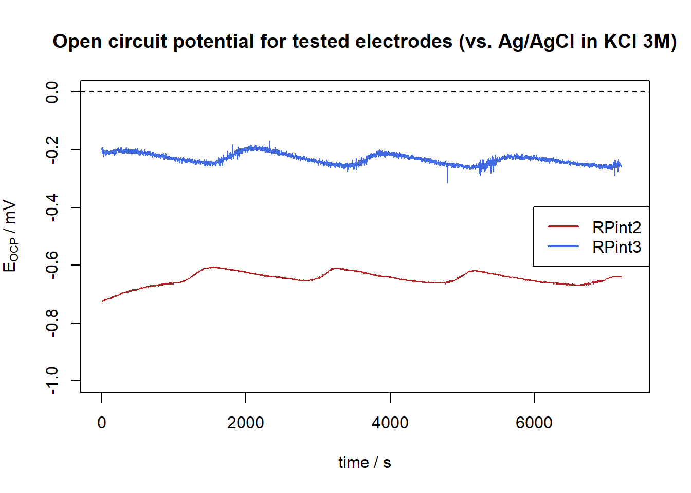
Figure 1: Snake-like oscillations in the recorded open circuit potentials, \(E_\text{OCP}\), for both electrodes against REP1 (208.0 mV vs. NHE).
Do you see the snake-like oscillations in Figure 1, every around 2000 seconds and with a magnitude lower than 0.1 mV? It is such an unimportant problem, that doesn’t determine the potential determined (it averages out!), but it bothers me so, so much. Where does it actually come from?
No, really. Where does it come from?
My first intuition as an inexperienced electrochemist was to ask my advisor. Her contextual response was to tell me contractors were working outside the building, and that “this messes with the ground connection”. Since I don’t have any experience in electrical issues, I took her word for it at the time and didn’t worry too much. However, I already decided to investigate the trend these voltages could produce.
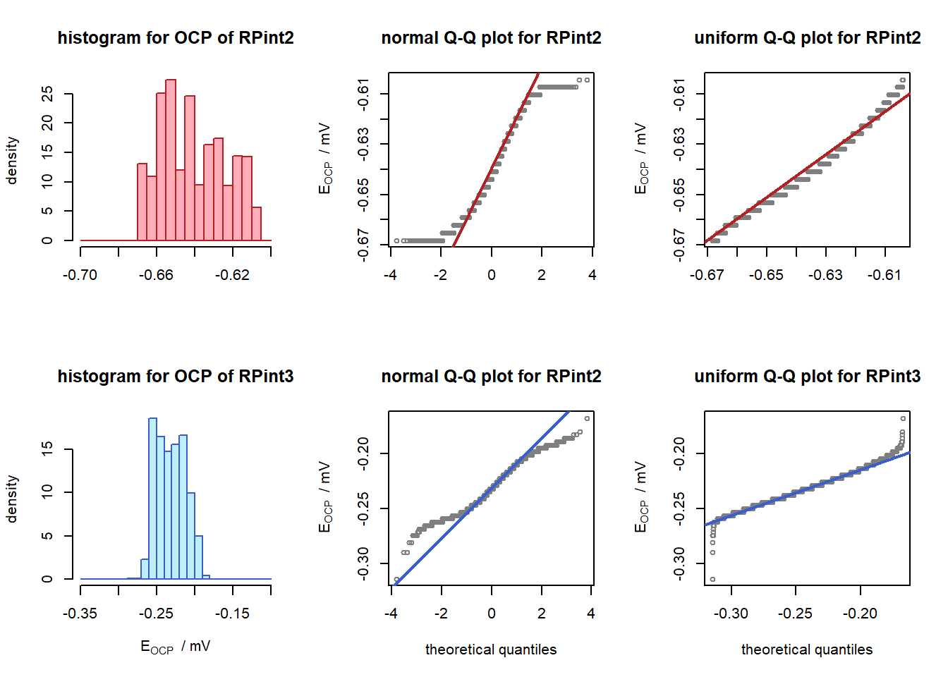
The shape of the curves suggest the voltages oscillate around a central value, so I wanted to test for two symmetrical distributions (i.e. uniform and normal). The Q-Q plots and the PPCC or Filliben’s test4 for both assumptions can be seen in Figure 2, and I’ve also gathered some summary statistics5 in Table 1.
Code: Implementation of the Filliben approximation in a QQ plot for normal and uniform distributions.
# Filliben's uniform order statistics mediansfilliben <-function(data) { n <-length(data) store <-c() store[n] <-0.5^(1/n) store[1] <-1- store[n]for (i in2:(n-1)) { store[i] <- (i -0.3175) / (n +0.365) }return(store)}# Generate shifted uniform distributionsgen_unif <-function(data) { mi <-min(data) ma <-max(data) f <-function(p) {qunif(p, min = mi, max = ma) }return(f)}# Store potentials in mVrpaint2 <- ocp2$`Potential / V`[-(1:1000)] *1e3rpaint3 <- ocp3$`Potential / V`*1e3# Generate uniform distribution windowsup2 <-gen_unif(rpaint2)up3 <-gen_unif(rpaint3)# Graphics generationlayout(matrix(c(1,2,3,4,5,6), 2, 3, byrow = F))# histogramshist(rpaint2, freq = F,xlab ="",ylab ="density", col ="lightpink1", border ="firebrick",breaks =seq(-0.7, -0.6, 0.5e-2), main ="histogram for OCP of RPint2")hist(rpaint3, freq = F,xlab =expression(E[OCP] ~" / mV"),ylab ="density", col ="lightblue1", border ="royalblue3",breaks =seq(-0.35, -0.10, 1e-2), main ="histogram for OCP of RPint3")# normality Q-Q plotsqqnorm(rpaint2, xlab ="", main ="normal Q-Q plot for RPint2",ylab =expression(E[OCP] ~" / mV"),pch =1, cex =0.75, col ="gray50")qqline(rpaint2, col ="firebrick",lty =1, lwd =2)qqnorm(rpaint3, main ="normal Q-Q plot for RPint2",xlab ="theoretical quantiles",ylab =expression(E[OCP] ~" / mV"),pch =1, cex =0.75, col ="gray50")qqline(rpaint3, col ="royalblue3",lty =1, lwd =2)# uniformity plotsqqplot(x =up2(filliben(rpaint2)), y = rpaint2, xlab ="", main ="uniform Q-Q plot for RPint2",ylab =expression(E[OCP] ~" / mV"),pch =1, cex =0.75, col ="gray50")qqline(rpaint2, col ="firebrick", distribution = up2,lty =1, lwd =2)qqplot(x =up3(filliben(rpaint3)), y = rpaint3, xlab ="theoretical quantiles", main ="uniform Q-Q plot for RPint3",ylab =expression(E[OCP] ~" / mV"),pch =1, cex =0.75, col ="gray50")qqline(rpaint3, col ="royalblue3", distribution = up3,lty =1, lwd =2)
Figure 2: Histograms and Q-Q plots for the electrode potentials vs. Ag/AgCl in KCl 3M, assuming normality (middle) and uniformity (right).
Code: Implementation of Filliben’s probability plot correlation coefficient (PPCC), plus the median and first four central moments of each dataset.
Table 1: Summary statistics for both electrode’s potential over time. RPint2 truncated before 1000 s. See footnotes for details on formulae.
It’s clear that both voltages follow, if any, an uniform distribution around their formal potentials. Since the emergent electrical noise from a potentiostat should follow a normal distribution6, this gives grounds (pun not intended!) to point to somewhere else. And since I have no expertise in electrical engineering…
There’s a spectrum of possibilities
…I happened to land on a beautifully written technical report from the North American SynchroPhasor Initiative7, that described how to diagnose and analyze the transient responses of a power system that’s oscillating. To me, this is sufficient to understand that
this system is oscillating way too slowly for an overtone of the power network to be happening. Even when a power system is mechanically forced, the resulting noise should be way faster. So, the construction workers are not to blame, and certainly not the 220 VAC network in place.
anything oscillating so slowly should be in the ballpark of pink noise, i.e. a signal with a power spectral density \(S(\nu)\) decaying as \(1/\nu^\alpha\), where \(0 < \alpha < 2\) is a constant and \(\nu\) is the frequency8.
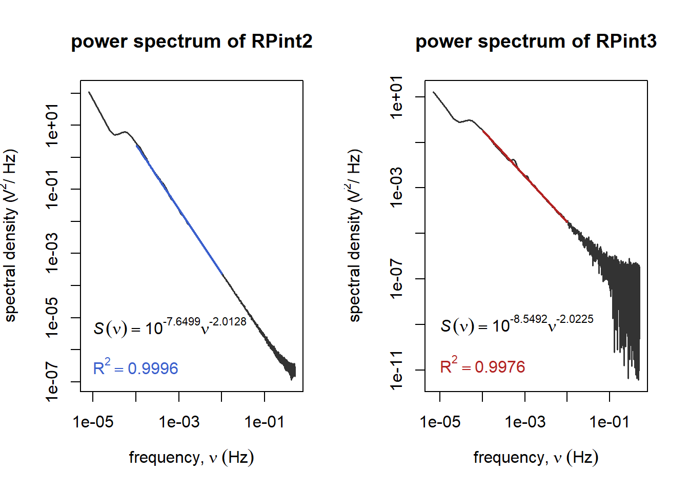
Being nowhere closer to being an electrical engineer, I decided to brush up on Fourier transforms and ask someone else9how to analyze a visible trend in the power spectrum. After zero-filling and transforming the data, a pair of periodograms appear with what seems to be a borderline pink noise.
Regrettably, the sampling period is a very long \(T = 1 \text{ s}\), which leads to an inaccurate Nyquist frequency of 0.5 Hz. This only helps us decode extremely low frequency trends, but luckily, this is all we need.
Code: Fourier transform and cleanup of both datasets to perform a log-log linear regression, looking for a pink noise-like trend.
# zero-padding implementationzero_fill <-function(x, times =9) { long = times *length(x) x <-c(x, rep(0, times = long))return(x)}# zero filled time-domain datazf_rpaint2 <-zero_fill(rpaint2, times =19)zf_rpaint3 <-zero_fill(rpaint3, times =19)# PSD estimationspaint2 <-spectrum(zf_rpaint2, log ="yes", plot = F)paint3 <-spectrum(zf_rpaint3, log ="yes", plot = F)# 1/f noise regressionbool2 <- (paint2$freq >=1e-4) & (paint2$freq <=1e-2)bool3 <- (paint3$freq >=1e-4) & (paint3$freq <=1e-2)pink2 <-lm(log10(paint2$spec[bool2]) ~log10(paint2$freq[bool2]))pink3 <-lm(log10(paint3$spec[bool3]) ~log10(paint3$freq[bool3]))layout(matrix(c(1,2), 1, 2, byrow = F))plot(paint2$spec ~ paint2$freq, log ="yx",type ="l", lwd =1.5, col ="gray20",main ="power spectrum of RPint2",xlab =expression(frequency *","~ nu ~ (Hz)), ylab =expression("spectral density ("* V^2*"/ Hz)") )points(x = paint2$freq[bool2], y =10^predict.lm(pink2),type ="l", lty =1, lwd =2, col ="royalblue3")coef <-round(as.vector(pink2$coefficients), 4)peq <-substitute(italic(S)(nu) ==10^int * nu^coef, list(int = coef[1], coef = coef[2]))text(x =1e-5, y =0.5e-5, col ="gray0", peq, adj =0)rsq <-summary(pink2)$adj.r.squaredrex <-substitute(R^2== rsq, list(rsq =round(rsq, 4)))text(x =1e-5, y =3.3e-7, col ="royalblue3", rex, adj =0)plot(paint3$spec ~ paint3$freq, log ="yx",type ="l", lwd =1.5, col ="gray20",main ="power spectrum of RPint3",xlab =expression(frequency *","~ nu ~ (Hz)), ylab =expression("spectral density ("* V^2*"/ Hz)"))points(x = paint3$freq[bool3], y =10^predict.lm(pink3),type ="l", lty =1, lwd =2, col ="firebrick")coef <-round(as.vector(pink3$coefficients), 4)peq <-substitute(italic(S)(nu) ==10^int * nu^coef, list(int = coef[1], coef = coef[2]))text(x =1e-5, y =1e-9, col ="gray0", peq, adj =0)rsq <-summary(pink3)$adj.r.squaredrex <-substitute(R^2== rsq, list(rsq =round(rsq, 4)))text(x =1e-5, y =2e-11, col ="firebrick", rex, adj =0)
Figure 3: Periodograms of the \(E_\text{OCP}\) time series with linear regressions in the 100μ-10mHz range.
What’s common between both is the bump between 10-100 μHz, which doesn’t align with an oscillation every 2000 s (i.e. 500 μHz). Moreover, the frequency exponents exceed 2, which suggests that what I’m seeing is not any more pink noise than it is my computer trying to show me a Dirac delta without exploding.
Then, was it all for nothing?
Not exactly. Apart from it being extremely fun (since I started writing it, there have been low lows and high highs in this research, and it all pays off), I have coded more intensely in R than I have anytime in 2025, which helps me maintain my R skills awake and ready for any opportunity that may come.
Moreover, this whole tour encouraged me to put out an incomplete result, with the sole purpose of having fun. :-)
And closing, the original question. I haven’t seen this mentioned anywhere, but what I suspect empirically and more as a witch tale, is that the day I was measuring potentials, the air conditioning must have been working overtime. Exhausted from cooling a room to a near perfect 22 °C while fighting off the spring-to-summer heat in South America, it might have let out a few gasps every twenty minutes or so, let its guard down and continued to function as if nothing happened.
So in a more magical note, this oscillation with a frequency in the tenths of mHz is, to me, nothing more than the AC unit calling for help, and the potentiostat experiencing it as temperature fluctuating in the room. Like the breathing of a ring.
Acknowledgements
I’d like to thank the NASPI for their masterful article on oscillations in power systems10. I’m grateful to whuber back at Cross Validated for an insightful response.
And, as always, thanks to Wikipedia for clearing out definitions on the way. Make sure to donate to Wikimedia Foundation so they can keep doing their mission.
Footnotes
Our lab’s temperature was at 21.5 °C that day. Here’s the catch: even assuming the temperature coefficient, \(\mathrm{d}E°'/\mathrm{d}T\), caused only a small (< 1 mV) drift in the electrode potential, \({E^{\circ} }' _\text{Ag/AgCl}\), a really thorough calibration should have considered this deviation. However, no matter how far I looked into the subject, I found no values for \(\mathrm{d}{E^{\circ} }' /\mathrm{d}T\) or any interpolation equation for \({E^{\circ} }'(T)\) across (a) any concentration range near 3.0 M and (b) at temperatures including 21.5 °C.↩︎
The normal hydrogen electrode (NHE) is a fictive two-electrode cell comprised by a Pt electrode submerged in a solution with an acid concentration of \(\left[\mathrm{H^+} \right]\) = 1 mol/L and a steady current of 1 bar of \(\mathrm{H_2}\) bubbled through. Its differences with the standard (SHE) and reversible (RHE) hydrogen electrodes can be found here but are negligible for our purposes.↩︎
This might be a witch’s tale at this point, but my colleagues have taught me even cable inductance, generated by coiling wires, affects the outcome of electrochemical experiments.↩︎
J. J. Filliben. “The Probability Plot Correlation Coefficient Test for Normality”. Technometrics1975, 17(1), 111–117. doi: 10.1080/00401706.1975.10489279. This is a historical paper that treats a new use of the Pearson correlation coefficient of the straight line drawn in probability plots, in evaluating the adherence of a certain dataset to a hand-picked distribution (cf. “normality”, “uniformity”, “gamma-ness”, etc.). You can read a freely available copy here.↩︎
The standard deviation \(s\) is calculated with the Bessel correction, i.e. with a factor of \(1/\sqrt{N - 1}\). The (\(s\)-normalized) third moment is the Fisher-Pearson skewness adjusted for sample sizes, \(G_1\): \[ G_1 = \frac{\sqrt{1 - 1/N}}{N-2} \, \frac{\sum_{j = 1}^{N} (x_j - \bar{x})^3}{s^3} \] whereas the fourth moment is the (\(s\)-normalized) excess kurtosis with respect to the normal distribution, without corrections for sample sizes: \[ g_2 = \frac{1}{N} \,\frac{\sum_{j = 1}^N (x_j - \bar{x})^4}{s^4} - 3 \]↩︎
By an ergodic argument: since the number of electrons (charge carriers) goes to infinity, the energy exchanged by their averaged thermal motion should follow the Central Limit Theorem, and thus show a normal behavior. See dsp.se 29475: “Why is Gaussian noise called so?” for a simpler explanation.↩︎
I’m pretty sure I’m pissing off some people in the electrical engineering community, but come on – \(f\) is reserved for far more interesting things and \(\nu\) looks cooler.↩︎